


As a Financial Advisor for the past 17 years, I’ve analyzed thousands upon thousands of charts on economics, finance and investing. But out of those many thousands, I always come back to two which, in my opinion, illustrate perfectly the secret to being a successful long-term investor. And that secret is:
Your ability to withstand pain is directly correlated to your likelihood of growing your wealth.
In other words, the longer you hold your investments, the more certain you are to live through a painful market downturn—and also to create generational wealth.
These two charts show exactly how it works.
Chart 1: The Likelihood of Pain
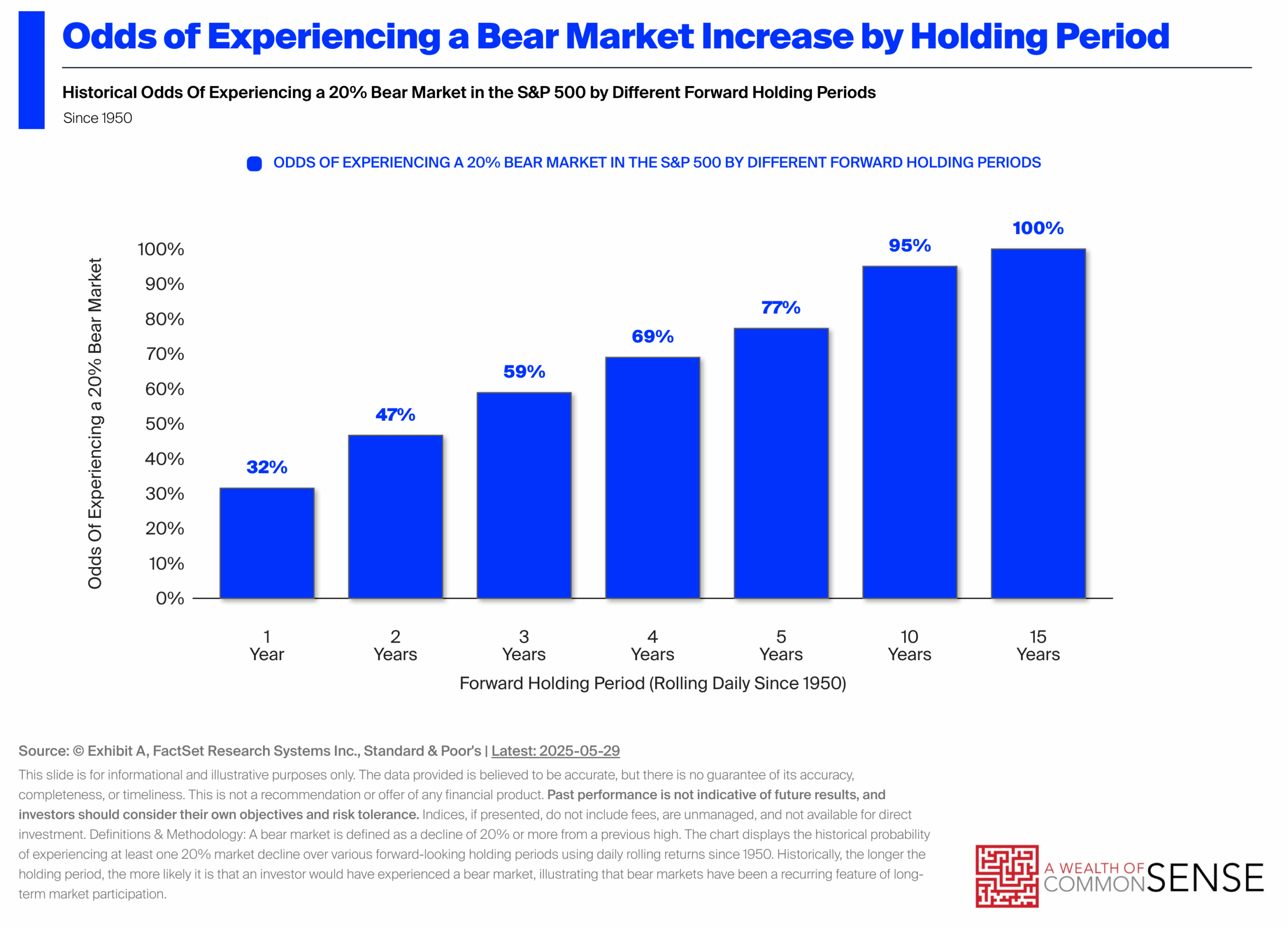
Here are the historical chances of living through a major 20% market correction (a full-blown Bear Market) based on how many years you keep your money invested:
- 1 Year: 32% chance
- 5 Years: 77% chance
- 10 Years: 95% chance
- 15 Years:100% chance
The Takeaway:
If you are saving for the long haul, experiencing a large market drop isn't an "if" — it’s a "when." Historically speaking, it is a statistical certainty. You will absolutely watch your account balance temporarily drop by an uncomfortable amount at some point. But we must accept that temporary pain in exchange for long-term gain. The next chart proves why it’s worth it.
Chart 2: The Payoff for Sticking It Out
So, why would anyone sign up to invest if pain is guaranteed? Because of this chart.
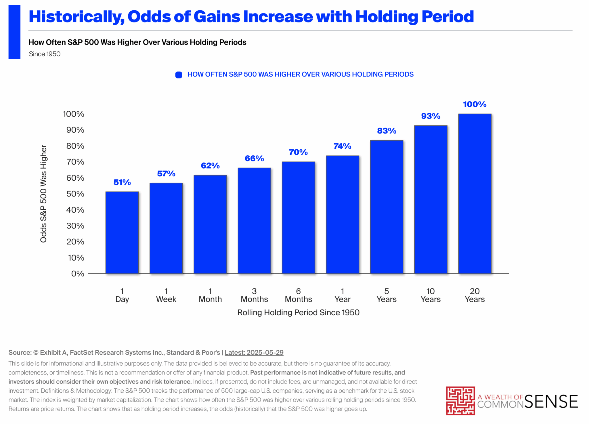
While the first chart shows the likelihood of a market downturn, this chart shows us the probability of generating an overall gain over various timeframes. Here is how often the market actually made people money if they simply stayed invested for the long term:
- 1 Day: 51% chance (Basically a coin flip)
- 1 Month: 62% chance
- 1 Year: 74% chance
- 10 Years: 93% chance
- 20 Years:100% chance
Let’s compare some common timeframes:
- The 5-Year Window: The likelihood of experiencing a 20% or greater drop in the market is nearly 80%... But the likelihood of generating a positive return over that same timeframe is 83%.
- The 10-Year Window: The likelihood of experiencing a 20% or greater drop is 95%. Yet, the likelihood of experiencing a positive return is also greater than 90%.
The Takeaway:
- Volatility is the toll for growth: If you’re on the road for the long haul, you’re going to have to stop and pay the toll booth occasionally. But as long as you stay the course, you will reach your destination. Market downturns are not final or fatal. They’re just a bump in the road, a pause in the journey.
- Time fixes everything: Many people incorrectly compare investing to gambling. But with investing, the longer you stay in the game, the higher your likelihood of success. As time rolls on, your probability of making money increases. This is the exact opposite of a casino. The longer you stay at the casino, the more likely you are to lose money. Long-Term investing IS NOT gambling.
The Market is a Toll Road
The biggest secret to investing isn't picking the perfect stock or timing the market just right. It's about mastering your own behavior when things get ugly.
Think of market dips like a highway toll, not a car crash. If you want to take advantage of the rewards of long-term investing, you have to be willing to pay the tolls along the way. That means sitting tight and enduring the periodic market drops.
The Bottom Line: Watching your balance drop temporarily isn't a sign that your plan is failing. It’s just the price of admission for building long-term wealth for you and your family.
Bonus Chart: The Market’s "Barcode"
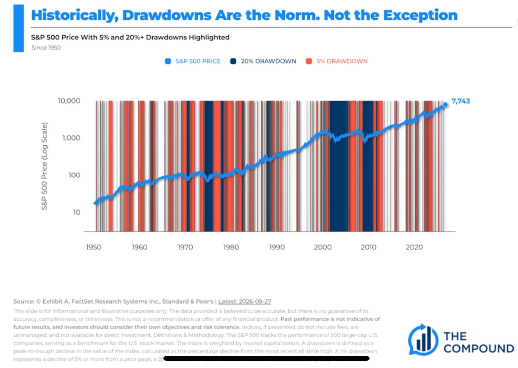
Take a look at this final bonus chart from popular investing podcast The Compound. It shows the S&P 500 going all the way back to 1950 over what looks like a chaotic barcode of red and dark blue stripes. Here is what those colors actually mean:
- Red Stripes: The market was in a normal 5% dip from its peak.
- Dark Blue Stripes: The market was in a full-blown 20% bear market drawdown.
- White Spaces: The market is actually sitting at a brand-new all-time high.
The Takeaway:
Notice how little white space there is on that chart. This means that more often than not, the market is actually below its most recent all-time high. In fact, the market spends about 60% of its time below its most recent peak. If you’re looking at your portfolio day-to-day, there’s about a 60% chance that the value you see is less than your most recent high-water mark. This can lead to frustration….anf frustration can too often lead to bad investment decisions.
But look at that solid blue line cutting right through the middle of all those stripes. That line represents the actual growth of the market. Despite being covered in red and blue dips day in and day out, what does that line do? It keeps climbing from the bottom left to the top right.
That’s generational wealth creation—but it was not a smooth ride. To put it in perspective, a simple $1,000 investment in 1950 would be worth $4.6 MILLION today. Yes, you read that correctly. Now imagine if the starting point was $10,000….or $100,000…
This chart is the ultimate proof of our highway analogy: the road is almost always full of bumps, potholes, and tolls... But as long as you stay the course, you still get to your destination, likely with a lot more money in your pocket.
How Indy Wealth Advisors Helps You Keep the Car on the Road
Knowing the math and seeing the charts is one thing. Actually watching your retirement nest egg shrink during a market downturn is a completely different ballgame.
When the television news is screaming that the sky is falling and your stomach drops into your shoes, the temptation to "just do something" and pull your money can be almost impossible to fight alone.
That is exactly where Indy Wealth Advisors comes in.
We don't have a crystal ball to predict when the next market correction will happen. No one does. Anyone who says they do is probably trying to sell you something that benefits them more than you. But we do know that they will happen. Our job is to make sure you keep the car on the road when that time comes.
Here is how we partner with you to handle the highway tolls of investing:
- Building a Custom Road Map: We build a financial plan tailored to your specific circumstances, your needs, and your retirement goals so you know exactly where you stand and how to get where you need to go.
- Securing Your Emergency Gas Tank:We’ll help you identify an amount of cash you should keep out of the market to cover unexpected expenses. This can help you avoid selling investments during a downturn which can be detrimental to your long-term returns.
- Serving as Your Co-Pilot:When the market gets bumpy, we are the steady hand on the wheel. We'll keep you focused on the long-term plan instead of the inevitable short-term noise to help you avoid the costliest mistake of all: panic-selling.
Building wealth doesn't require a Nobel Prize in economics. It doesn’t require perfectly timing the market or avoiding every downturn. It just requires a well-thought-out plan and the resolve to follow it when things get a little scary. Our job is to keep you on the road and focused on your destination.
Sources: The Compound, Factset, A Wealth of Common Sense
Securities and advisory serviced offered through LPL Financial, a registered investment advisor. Member FINRA/SIPC.
LPL and Indy Wealth Advisors are not associated with "The Compound"
All investing involves risk including loss of principal. No strategy assures success or protects against loss. The opinions expressed in this material do not necessarily reflect the views of LPL Financial. Content in this material is for general information only and not intended to provide specific advice or recommendations for any individual. All performance referred is historical and is no guarantee of future results. All indices are unmanaged and may not be invested into directly.
The primary benchmarks for the large-cap market are: S&P 500 index. The S&P 500 index is considered the benchmark for the US Stock market. It is an index of approximately the largest 500 companies based on market capitalization.